
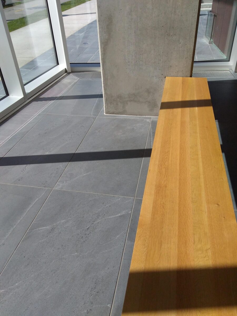
I was working at a college today. It’s a new building and the college has a whole floor with the interior decoration not quite completed. Yet it is enough for classes to be held. Here I was observing the main design features within this space. As I was curious how these features might be reflected in a wider perspective considering the purpose of this place. Namely education within the creative arts. This article are my musings from the two art campuses.
Key features of art campus A:
- Room was one big open space.
- Floor was plain shiny grey concrete.
- Walls painted white, concrete.
- Ceilings high, plain concrete with suspended silver metal air heating ducts and other ventilation.
- Tables rectangular, plain light grey, material unknown.
- Floor to ceiling windows with natural light.
My impression was of stark, straight lines, no curves. Grey. White. Neutral. No colours. Cool. Industrial. Minimalist. Soulless.
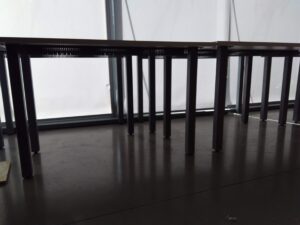
Art campus A: grey floors stark walls and tables 
Art campus A: exposed concrete ceiling metal ducts echo sounds
This designated space is for learning, exploring and practicing the creative arts. The space had not been laid out as a gallery display area. Not as a sports room or a storage area. However, it could easily have functioned as one of these due to the interior decoration.
Education within the arts and entertainment are the primary function of this campus. Students are there to nurture their creativity and welcome motivation for their future career. Consider for a moment since childhood how influential our education experiences have been. Our time spent at various nursery kindergarten, schools, college and university has contributed to a fair part of our upbringing.
Our physical and mental states are affected by the environment. Design and layout of a space determines how we interact and communicate with one another.
A personal story from a Montessori school
This is a personal story from when I was studying feng shui. I went on a field trip to a Montessori nursery school. With a Steiner inspired interior and exterior designed. First impressions were of this amazing building with it’s grass turf roof, arched windows set at child view height and domed ceilings. We were told that the boys found the environment too restraining and needed to burn off energy outside. Whereas the girls tended to feel more comfortable and calm.
Returning to the arts campus. These are my observations to enliven and make the room a more ‘user friendly’ creative environment and to include a serenity space.
- Screens for separating areas, spaces within the space. Use of natural based materials like bamboo for screens.
- Textiles to soften the sharp, straight edges and provide feeling of warmth.
- To cover the cement floor with a texture and/or density to reduce impact of hardness. A softened floor covering is beneficial when people stand for long time. It reduces the effects of tired legs and posture. Reduces the hollow echo sounds.
- Introduce Colours that evoke learning, curiosity, motivation
- Lower ceiling in some parts to reduce the ‘big open space’, promote focused conversation/learning.
- Provide Desks with some curvature.
- Include A serenity space for quiet reflection or nap.
Serenity space
Setting up an area where students can call it their own, that it won’t be disturbed or moved or utilised for another purpose.
Feature ideas:
Display thought-provoking or inspiring images, words and objects.
Comfy and cosy seating e.g. bean bags, to have a nap with an eye shade, a time for mindfulness or simply a change from computer chairs.
Plants like Ivy that re-energise the air and reduce the effects of electromagnetic radiation emitting from equipment such as wifi and cell phones. (Ref.3)
Arts college campus B.
Visiting this building I found was more inspiring. The arts campus is located on the top floor of an older building.
Key features art campus B:
- Lots of exposed natural wooden beams, wall struts and flooring.
- Tall ceilings with natural day light.
- Creative vibe.
- Student’s work on display
- Desks variety of sizes, well used, laid out to suit student.
- Chairs various colours.
- Expressive and messy.
- Relaxed feel.
Asking how people felt
When I asked the tutor what made a difference to the students in this environment. They replied, that the students each had their own space with their stuff. The layout was organic (not too organised) so everyone could be seen, see what they’ve created and there was a free flow of communication. A popular comment was that there was a true sense of community.
I then asked a few students what they thought of the general environment and what influenced their creativity. They liked having their own desk spaces to be self expressive. That they gathered in small groups, to chat, discuss and look at each other’s work. The florescent lighting was mentioned as it could be irritating to some, with flickering. They preferred the natural light available, yet this depended on the season.
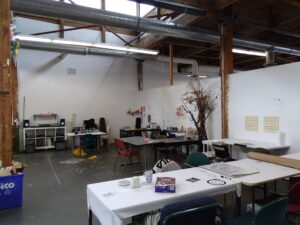
Campus B student space organic creativity 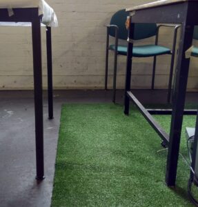
Faux grass floor covering to soften hardness and noise 
Campus B wooden ceiling softens metal pipework 
Campus B chairs colour selection
One thing to add is that highly sensitive people (HSP) are estimated to be 15-20% of the population, with a higher percentage in the creative fields. We embrace inclusiveness much more these days. With over 1 in 5 people being highly sensitive. Why aren’t sensitive people being considered in design decoration? Why isn’t greater emphasis put on using eco, green furnishings and building interior decorations? (Ref. 1)
I definitely think colour has an affect on our psyche. One article I found interesting ‘The Psychology of Color: How Do Colors Influence Learning?’ It suggests that green is good for improving concentration. Orange is a mood-lifting colour that positively affects neural functioning. (Ref. 2).
Feng shui
Some years ago I studied and practiced the ancient wisdom of Feng Shui. This system of lifestyle and design suggests that to promote right brain activity, relating to creativity and solution focus, it is beneficial having interior decoration formed of curves, rounded edges and flowing lines. The human body is formed of wavy and straight lines and blobby shapes, in the natural world it’s the same. I’m not saying we should build hobbit-homes! Yet with observation taken from what works in nature for shelter and nurturing healthy beings. Then surely places of creative learning could incorporate more shapes, colour and texture?
I’m an advocate for having a dedicated space, or shared if there’s limited area available, designed for human quietness. In this interior design space you might include one or more of these:
An area created for the practice of a self nurturing activity, such as mindfulness meditation. Interior design for acknowledging, respect and valuing of certain people. This could also include a dedicated altar for certain causes, events and people. For those that have inspired us or supported us or maybe now no longer with us. I call these Serenity spaces. It is time to give ourselves the alchemy of Pause Moments For You, to simply ‘be’.
The question is why?
Why is it when we know what enhances creativity, do architects and interior designers and decorators not incorporate these beneficial interior design features? Is it purely budgetary constrains?

Subscribe on email and you’ll be notified about new episodes.
Read this article on LinkedIn https://www.linkedin.com/pulse/interior-design-teaching-room-does-affect-how-we-feel-2simplifylife/
Sources and references
(Ref. 1)Article in Psychology Today referring to highly sensitive person
(Ref. 2) https://www.shiftelearning.com/blog/how-do-colors-influence-learning
Excerpts:
“Colors can affect neurological pathways in the brain? And that they can create a biochemical response?
Dr. Robert Gerard recognizes this and has pioneered research, which suggests that every color has a specific wavelength, and each of these affect our body and brain in a different way.
“Using the right color the correct selection and placement can seriously affect feelings, attention and behavior when learning.”
http://www.smh.com.au/technology/sci-tech/seeing-green-boosts-your-concentration-research-shows-20150525-gh8udh.html within this article it states:
“Green is an excellent color for improving concentration” [2] Seeing green boosts your concentration May 25, 2015.
” Orange can be a welcoming and mood-lifting color for learners, which in turn promotes comfort and improves neural functioning. [3] Best Color For Concentration And Productivity Is Orange from Huffington Post.
“Some theorists argue that an environment rich in the color orange increases the oxyen supply to the brain. Stimulating mental activity while simultaneously loosening peoples’ inhibitions. An increased oxygen supply also leads to feeling invigorated and getting ready to get things done.”
1.Effect of Different Colors on Human Mind and Body
Electromagnetic Radiation
(Ref. 3) Life Advancer Electromagnetic Radiation site Michelle Liew writes “Ivy is one of the best absorbers of radiation. It takes in 90% of Benzene from the air within 24 hours. Ivy beautifies the surroundings and improves air quality, eliminating carbon dioxide, carbon monoxide, and EMRs. It thrives on little water and bright light.”
In this Podcast Episode I write about the transition and energies of Spring time towards Summer and the uses of Dandelions.
I run workshops and this Article covers the positive outcomes from participants who started to design their own home serenity space dedicated to acknowledging a life changing event.
What interior design influences do you remember?
Tell me what interior design features you recall as having a positive beneficial or unhelpful affect on your education. Let me know here.
Hashtags
#pausemomentsforyou #serenityhomespace #calmenergy #clutterfree #homeretreat #personalretreat #transformational #mentalwellbeing #hugge #groundingtechniques #changemylife #feelinginspired #holisticlifestyle #innerwisdom #timeforme #slowlifestyle #mindfulnessmeditation #worklifeintegration #balanceyourlife #yogalifestyle #consciousconsumer #worklifebalance #metime #ecointeriordesign #chronicfatiguesyndrome #positiveliving
#interiordesign #interiordecoration #colourpsychology #sustainableenvironment #pausemomentsforyou #fenghsui #lifestyle #highlysensitivepeople #ecobuildings #learning #serenityspace #napping #naptime #mindfulness #quietreflection #creativespark #serenityspace #grounding #slowliving #improveproductivity # #electromagneticradiation #EMF #authentic #color @life_advancer @mynaturallifestyle @layoga @naturalhealthmagazine @reelgreen
